When it came to staff shirts, we resorted to white embroidery on black shirts. originally I had white shirts with a full color logo, but those were loathed by everyone, and they were hard to keep clean. You may not know this but everything we sell sits in a dirty warehouse before getting to us and gets even dirtier as it sits on our shelves. Keeping a retail store clean is a major feat, as it starts dirty and only gets worse. White shirts were always getting stained and looking bad.
The black, embroidered shirts we currently use, with a boring plain white stitched logo, turned out to be incredibly expensive. Each shirt costs $70 with embroidery. They also need to be made in batches in various sizes, so we're almost always buying more than we need, in sizes we hope will be useful. Invariably, those sizes don't match our diverse staff. So over time, we've been stuck with a box of very expensive shirts in the wrong sizes. The cost of bad design turns out to be very high.
Our new shirt design features a full color patch that can be sewn onto a variety of shirts. We choose the shirt from the Work Wear store next door, grab a patch, and sew it on. No big batches of variable sized, expensive, embroidered, logo perverting shirts. Also, if I want one of my robust, tactical shirts from 5.11, I buy it in the right color and sew on the patch, something not available before. Total cost per shirt for employees will be $25 or so, with no waste.
Then there's the increased merchandising we tend to avoid with the old logo. We've already ordered new patches, pins, stickers, and more. We'll have hats and t-shirts eventually. These were difficult to design with the old logo requirements and they sold poorly.
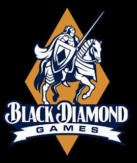
Now let's get onto the minor controversy of our design choices. We spent about a month defining the needs of the new logo with half a dozen designers. We identified core requirements. It should maintain the design elements of the old logo: the knight, the horse, the lance, the direction it's all headed (very symbolic) and of course, a diamond. The logo needed to remain fairly simple. The name needed an updated font that was compact with the design. The previous font used long, horizontal text and has been nothing but trouble for 15 years. The color black is problematic. It goes with nothing but white. Those who use black in their logos hamstring themselves design wise, so we omitted that. In fact, I would probably pick a different store name without a color in the title if I were to do it over. I have few regrets, but "black" is one. Let's take a look at the new design:
I think it pops. Rather than black, we have a dark blue, which works much better and represents one of our colors. It's a darker blue than our original logo (which some say was purple, a color I love). The diamond color, away from black, represents a shift in store colors that came about with our big construction project, three years ago.
This orangish yellow is called Curry in Sherwin Williams colors, which is the color we painted our staircase. It's a color that matches our birch fixtures. It provides a pleasing blue and gold ambience, the colors of the local university, UC Berkeley.
This shift in store colors came in a moment of crisis. The Curry color came from a decision I made with the architects when it was clear our paint color choices weren't working in practice. I was distracting myself at the time with another project, a used Jeep I was about to buy in Utah, because Utah was the closest location of a Jeep in this exact color I was smitten with. I had to have not only the features I was looking for, but it had to be in that color. It was clearly on my mind. Originally the Curry color was white, but when we painted it on on the staircase, it looked terrible.
So the color of the staircase and thus the logo got their color from a Jeep. The Jeep is in a Chrysler color called Amp'd. And thus our staircase became Amp'd, and our logo became Amp'd. And for the foreseeable future, we shall be Amp'd. Most people like the new logo, once they've accepted (or more often overlooked) the diamond isn't black. It's a tough ask, but if people can accept the Starbucks mermaid isn't holding up her legs suggestively any longer, I think this can be overlooked. Personally I love the direction of the logo. I especially love I won't be paying $70 each for a box of useless shirts.


No hay comentarios:
Publicar un comentario